This article was produced by Jonite
Understanding the psychology behind it highlights the importance of color theory in architectural design. Renowned Swiss psychiatrist and psychoanalyst Carl Jung once described colours as the mother tongue of the unconscious. Colours have a profound effect on human emotions, and grasping this symbiotic relationship is crucial to creating spaces that speak to people.
Understanding the Psychology of Colour Theory
Colour isn't just something people see — it invokes reactions in people. The key duty in architecture is to improve living conditions and comfort through spaces. When used effectively, colours can become powerful tools at an architect's disposal. They offer a form of non-verbal communication that tells people in a space how to feel and conveys something about what the space is used for.
While understanding the psychological effects of colours is crucial, you may also benefit from implementing techniques inspired by the pleasure-arousal-dominance (PAD) theory. PAD goes beyond the typical notions of “blue is calming, red is sensual” — it gets into the nitty gritty of using high and low-value colour contrasts and chroma and their effects on human emotions.
Combining PAD and colour theory helps release the true impact of colour in interior design and architecture.
How Colours Influence People's Emotions in a Space
The true importance of colour theory in architectural design is painting emotions through the space. In order to do that, you must understand the subliminal significance of prominent colours and where to use them for peak signaling.
White
White is a common colour used in many spaces from offices to kitchens. It's the best blank canvas and can effectively make small spaces look bigger, but it also has negative outcomes if used incorrectly.
As a general rule, white doesn't work as the dominant colour. Too much makes a space seem cold, clinical, isolated and sterile. It can also confuse users of a space on the intentions of the area. However, white can make a space appear clean, crisp and well-lit when used to highlight other colours.
White diffuses light sources when placed on a ceiling and reduces shadows. On walls, white may be too neutral, but it can create beautiful contrasts. Using it on floors acts as a touch inhibitor, which may create unconscious anxiety when entering the space.
The key emotions that people feel in a white space are:
- Cleanliness
- Emptiness
- Brightness
Blue
Blue is one of the fundamental aspects of colour theory used in commercial architecture. It does hold many benefits, such as possibly decreasing blood pressure and promoting a sense of calm, but when used incorrectly, it creates a melancholy environment.
PAD theory plays a significant role in how blue comes across. Light blue on ceilings creates a heavenly, peaceful feeling, but it can seem cold and distant on walls. Darker blues add depth to a space when applied to walls but may feel heavy when used on ceilings.
Blue is commonly used in professional spaces like offices, banks and security companies as it conveys a sense of trustworthiness, especially darker hues of blue. It can also change the perception of colour in urban spaces by increasing the sense of safety and calmness.
The common feelings blue creates are:
- Confidence
- Calmness
- Tired
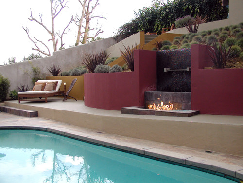
Red
Red is one of those colours that truly showcases the power of colour perception in architecture. It stirs passion, warmth and awareness. Fast food chains typically use red crockery because it increases hunger signals. When used incorrectly, red can be overly stimulating and come across as too intense or aggressive.
The human eye tends to perceive red objects as being closer than they actually are. You can use this effect to your advantage by using red elements to create focal points in the space.
Be wary of where you place red, as it can be disturbing and heavy when used on ceilings and may come across as aggressive or bloody when overused on walls. It's best to use red in only a few specific areas to create harmony and vibrancy. In some spaces requiring a sense of alertness, red works when placed along the floor to stimulate awareness.
The main emotions red stirs, when used correctly, are:
- Excitement
- Activeness
- Focus
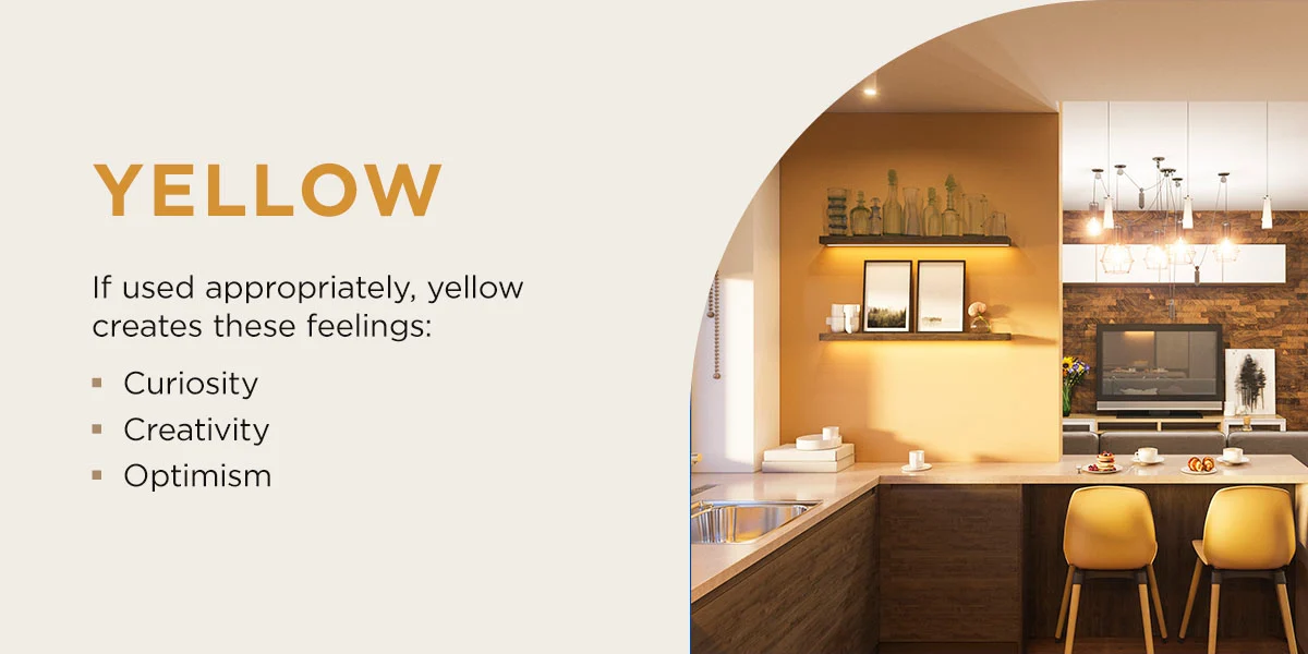
Yellow
One of the key reasons why colour is important in architecture and design is it can refine modern and traditional home designs by making people feel more comfortable and happy in a space. No colour is more uplifting than yellow. It's associated with the sun and radiates warmth and happiness.
You can use yellow on ceilings, walls or floors to create a cheerful or creative space. However, steer clear of using large amounts of bright, luminous yellow or warm yellow, as these can cause irritation and come across as eccentric.
If used appropriately, yellow creates these feelings:
- Curiosity
- Creativity
- Optimism
Green
Green is one of the main colours architects use when creating harmonious urban streetscapes or in hospitals and rehab centers. It's the most restful color for the eyes and promotes a sense of peace and relaxation. Green also symbolizes nature which is why biophilic architecture promotes well-being. People are naturally happier when surrounded by nature. However, it must be paired with elements like plants and tree grates to accentuate the feeling of the outdoors.
Green may be irritating in shiny or neon shades. You could use green on ceilings, walls or floors, but for certain spaces like health care or beauty, you should limit its use as it may look unattractive when reflected on the skin.
Green colour palettes and schemes in architectural design evoke emotions like:
- Relaxation
- Wellbeing
- Tranquility
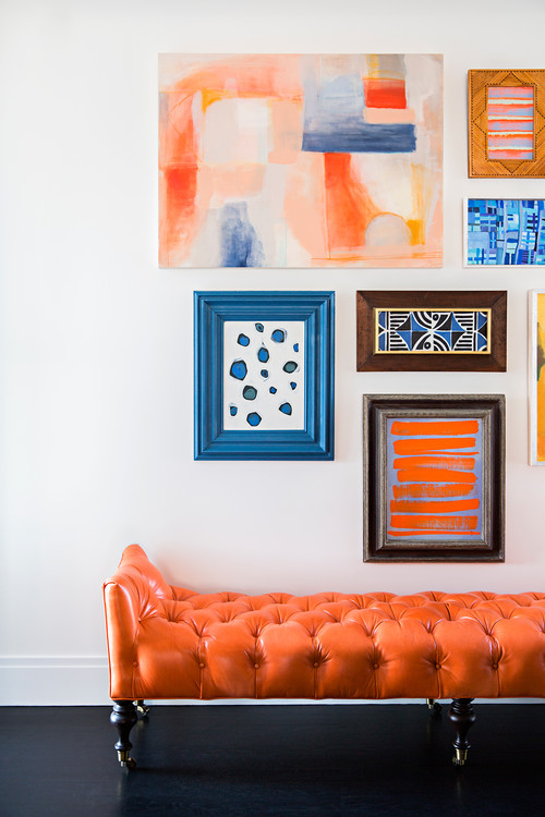
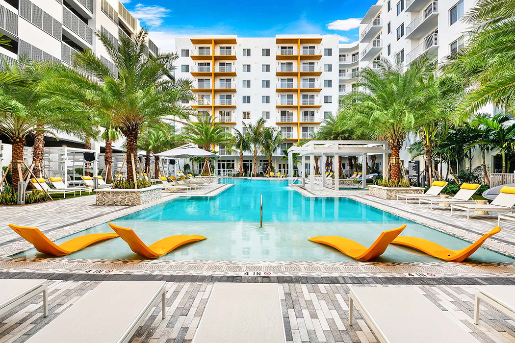
Orange
Orange is a prominent colour in architectural design that creates excitement and promotes joy. When used on walls, it encourages warmth and excitement but comes across as noisy when it fills the space. Orange on floors is excellent for studios and gyms as it boosts activity and movement.
Avoid low-pigment oranges, as they can come across as cheap and opt for brighter shades for walls and floors. Applying it to ceilings may be overstimulating. Vibrant orange works great to bring life to offices, schools and banks.
When used correctly, orange creates:
- Enthusiasm
- Excitement
- Impulsivity
Purple
Architects use purple to abide by color theory to create calming and soft spaces. It's a common way to apply color psychology in community health because purple encourages feelings of well-being and confidence. Deeper shades of purple, like violet, manifest a rich, royal and exclusive atmosphere, but when used excessively, they come across as pompous and conceited.
If you're using purple on walls, you can prevent it from being too heavy by only covering the bottom half with purple. The color may feel somber on ceilings but creates a magical feeling when applied to floors.
The main feelings purple induces are:
- Calmness
- Luxury
- Health
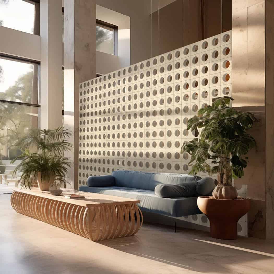
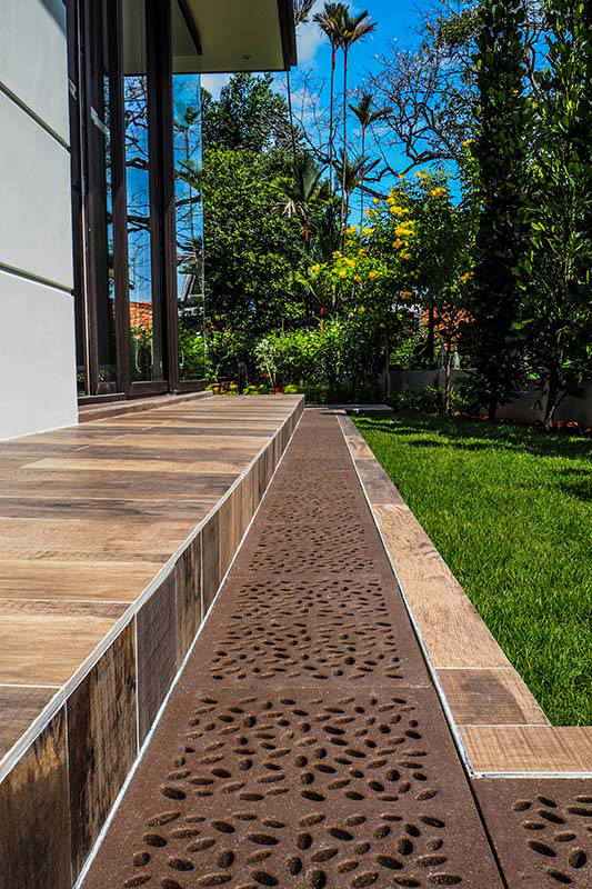
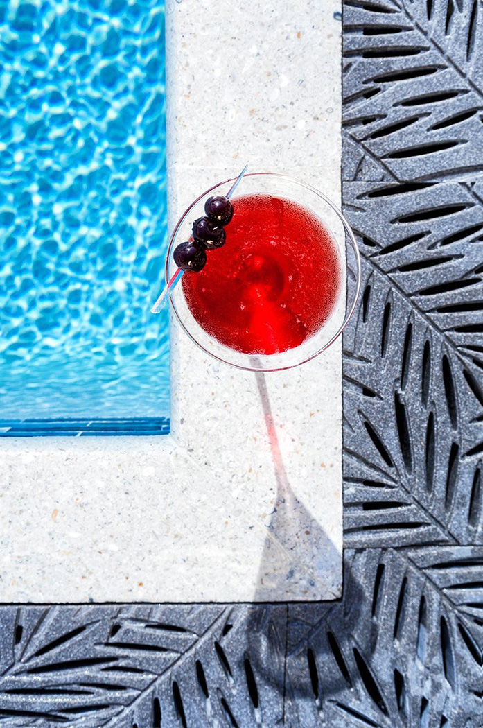
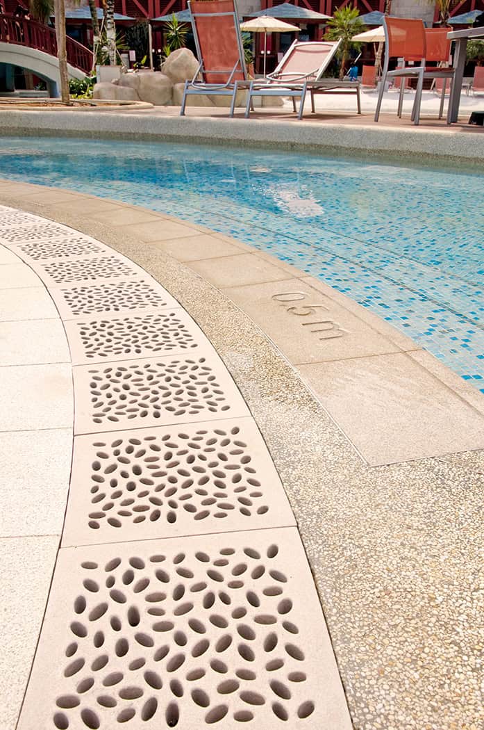
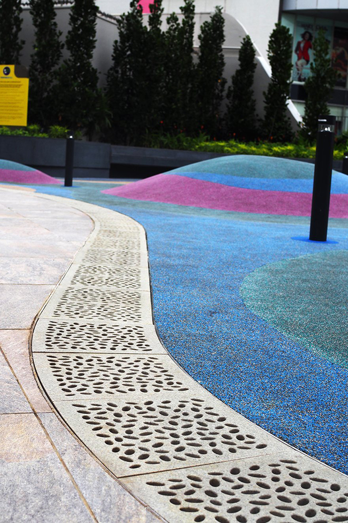
Create Bold Designs with Jonite
Add color to your designs with Jonite's powerful stone hardscape products. Available in 16 standard colours, with customs colours or colour matching available; let your imagination run wild.